info@CMMCreativeStrategies.com • 303.525.9837
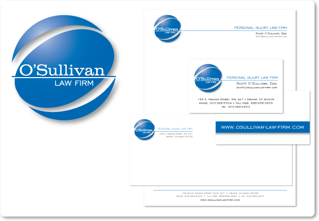
O'Sullivan Law Firm
A personal injury law firm.

The O'Sullivan Law Firm approached us about designing a logo for them to help separate them from the crowd of personal injury lawyers and as the first step in rebranding the firm. We were clear about avoiding popular imagery commonly associated with the law and that the focus should be on the name O'Sullivan. Many key concepts were brought into play throughout development such as "confidence" and "safety".
Another key point was that we determined that traditional advertising (print, TV, radio) were becoming diluted forms of reaching out (in the case of lawyers) and that the O'Sullivan Law Firm would be utilizing Web technologies and social marketing as primary means of communication. This meant that the logo had to command respect in these mediums.
Another key point was that we determined that traditional advertising (print, TV, radio) were becoming diluted forms of reaching out (in the case of lawyers) and that the O'Sullivan Law Firm would be utilizing Web technologies and social marketing as primary means of communication. This meant that the logo had to command respect in these mediums.
info@CMMCreativeStrategies.com • 303.525.9837